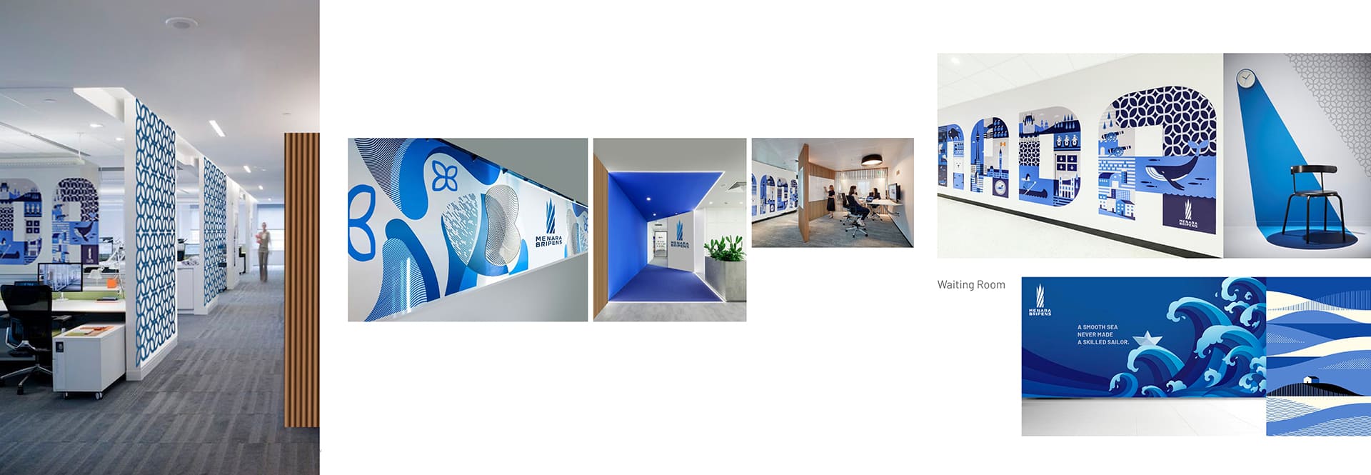


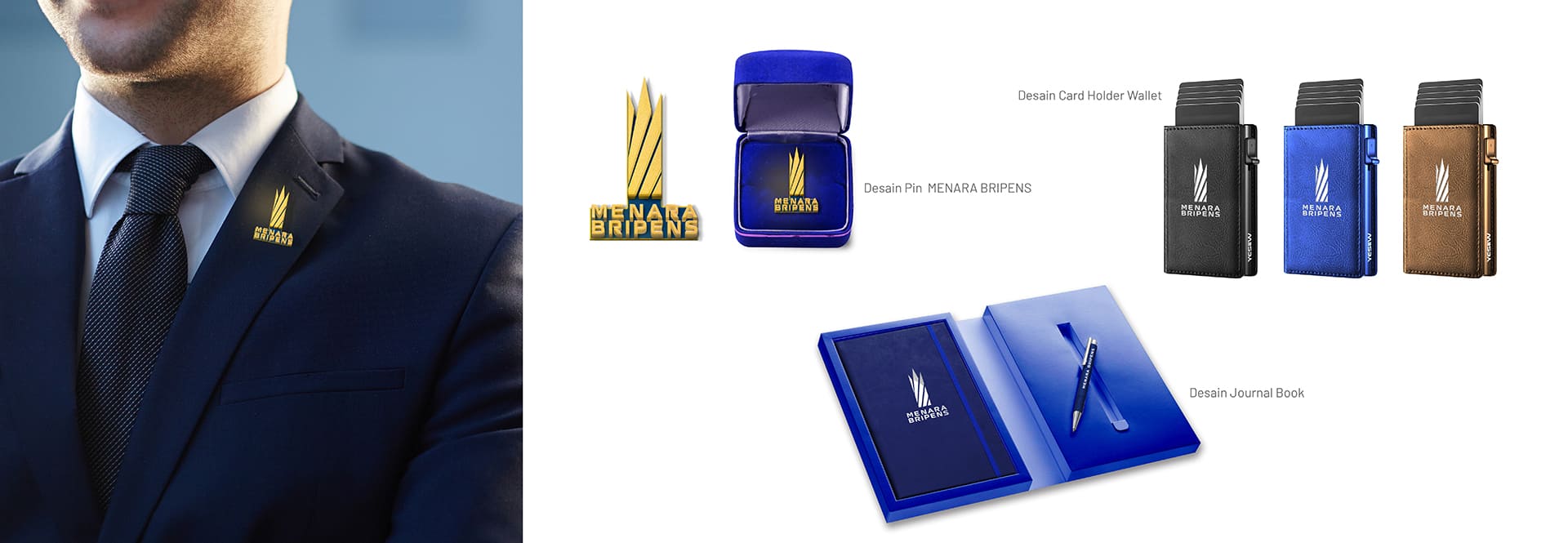
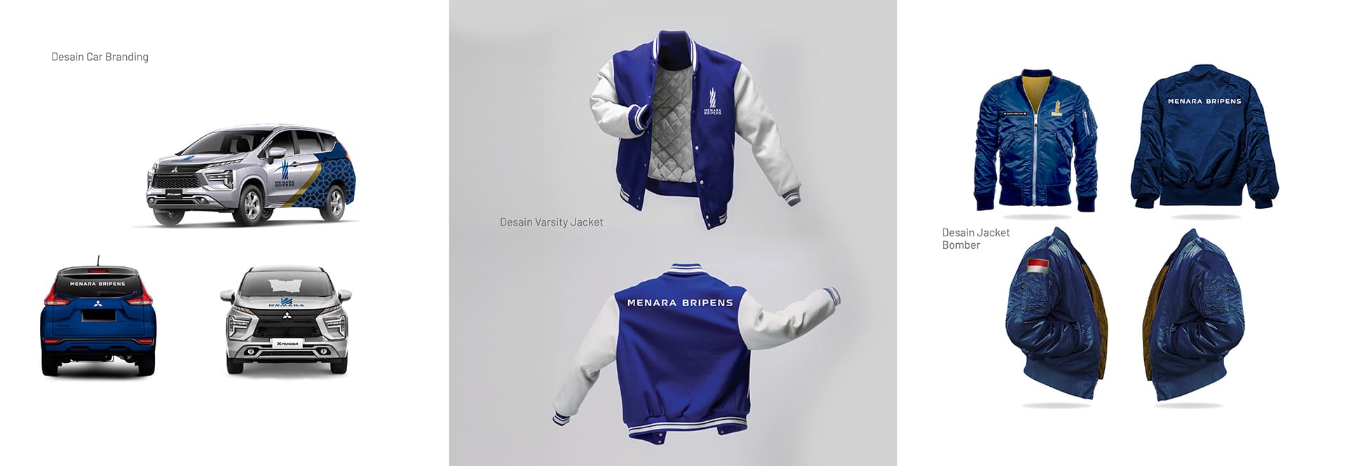

Corporate
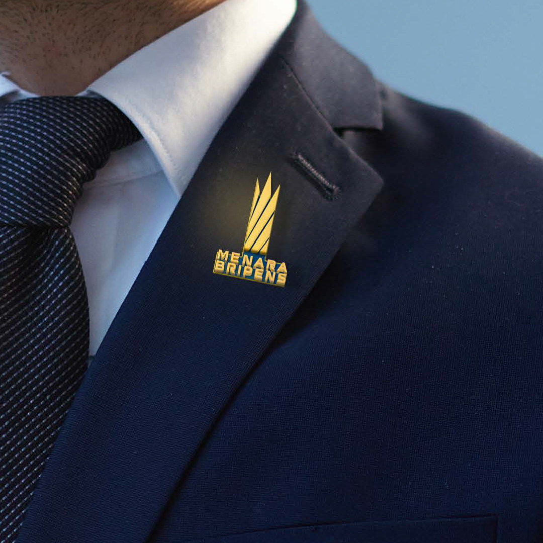
The logo's shape, which represents luxury and prosperity, is derived from the shapes of a crown, rice and an expanding progress graph.
With the brand name MENARA BRIPENS under its logogram, the overall design depicts a contemporary and robust edifice.
The blue color is derived from the BRI corporate color and represents business stability; it is envisaged that tenants with offices in MENARA BRIPENS will develop better and more established as BRI. Along with representing the idea of a bright future, blue is also used to represent the sky where the big structures grow.